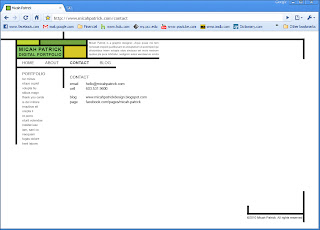
This is what my website is going to look like. Simplicity of navigation was very important to me. You will be able to get to any page in the site with one click from the home page (or from any other page for that matter). Keep in mind this site is my digital portfolio, it doesn't replace this blog, therefore it will only have a limited number of pieces on it.
This is the home/ portfolio page. In the center there is a cluster of thumbnails that you can click on to go directly to a piece. Alternatively you can get to a piece by clicking on its name on the left. You can do this from any page on the site. At the top there is a brief description of me that appears on every page. The cluster of thumbnails was inspired by The Power of One.
Here is an example of a portfolio piece page. The name of the current piece on the left becomes bold and darker. Left and right arrows allow you to move to the next piece or you can choose one from the list. Eventually if I put more pieces on the site there will be categories which will increase the one click policy to one or two clicks. There is also space for a short description of the piece on the bottom right.
About page. The short description from the top moves down and is elaborated upon. Right now it is filler text so I don't know how much type there will be. This is not the image I will be using and the overall layout of this page will likely change when I write the copy. The "site map" is also found on this page. It's really more of a web illustrating the fact that every page can access every other page with one click!


Stop making us look bad by being awesome.
ReplyDelete